Client
GetYourGuide
Resposibilities
UX / UI Design
UX Audit
UX Research
User Interviews
Card Sort Testing
Prototyping
Category
B2B
Software
Travel & Tourism
Year
2022 - 2024
Improving Guidance Through a Navigation Redesign
In lacinia hendrerit enim, quis gravida est sollicitudin in. Sed id velit nunc, quis pretium magna. Ut id urna a nulla bibendum malesuada quis sit amet risus. Lorem ipsum dolor sit amet, consectetur adipiscing elit. Cras commodo, sapien eget suscipit ullamcorper, orci risus sagittis metus, eget aliquet diam ligula ut neque. Sed purus nulla, posuere sit amet porta rhoncus, dapibus ac justo. Etiam lacinia pellentesque sapien at pretium.
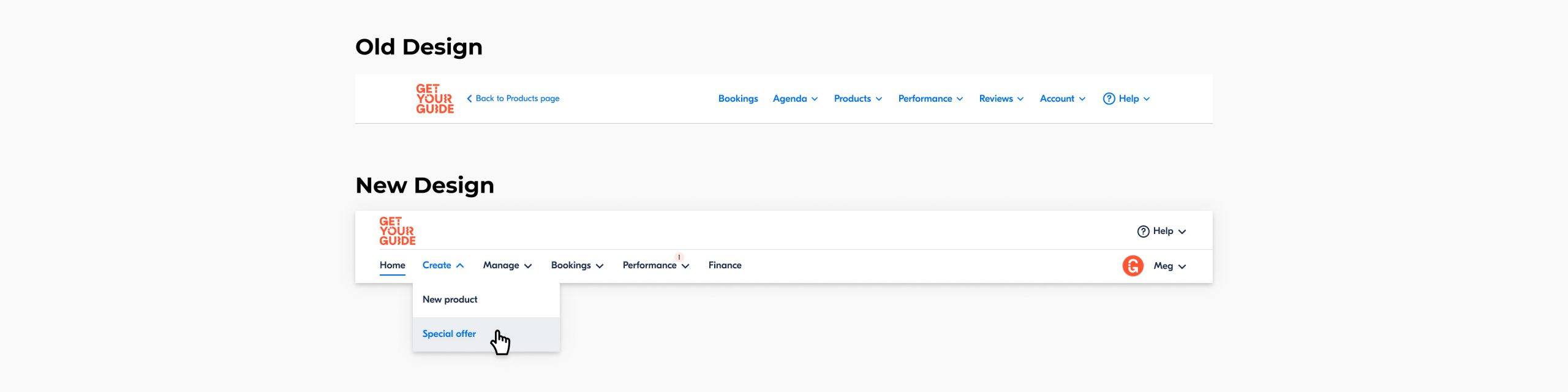
The Problem
A UX audit revealed that the supplier portal lacked clear guidance, and the main navigation was a key source of confusion. Because the platform operates entirely in English, many labels were difficult for non-native speakers to interpret, which often led to misunderstanding. At the same time, experienced users relied heavily on muscle memory to locate features, even when the structure itself wasn’t intuitive. Additionally, stakeholders pushed for a sidebar navigation to follow current design trends, but this layout didn’t align with the portal’s content, workflows, or user needs. Altogether, it became clear that the navigation required a clearer, more logical structure that could support both new and returning users.
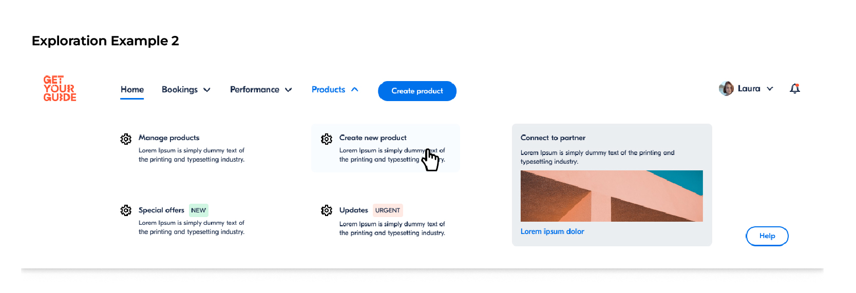
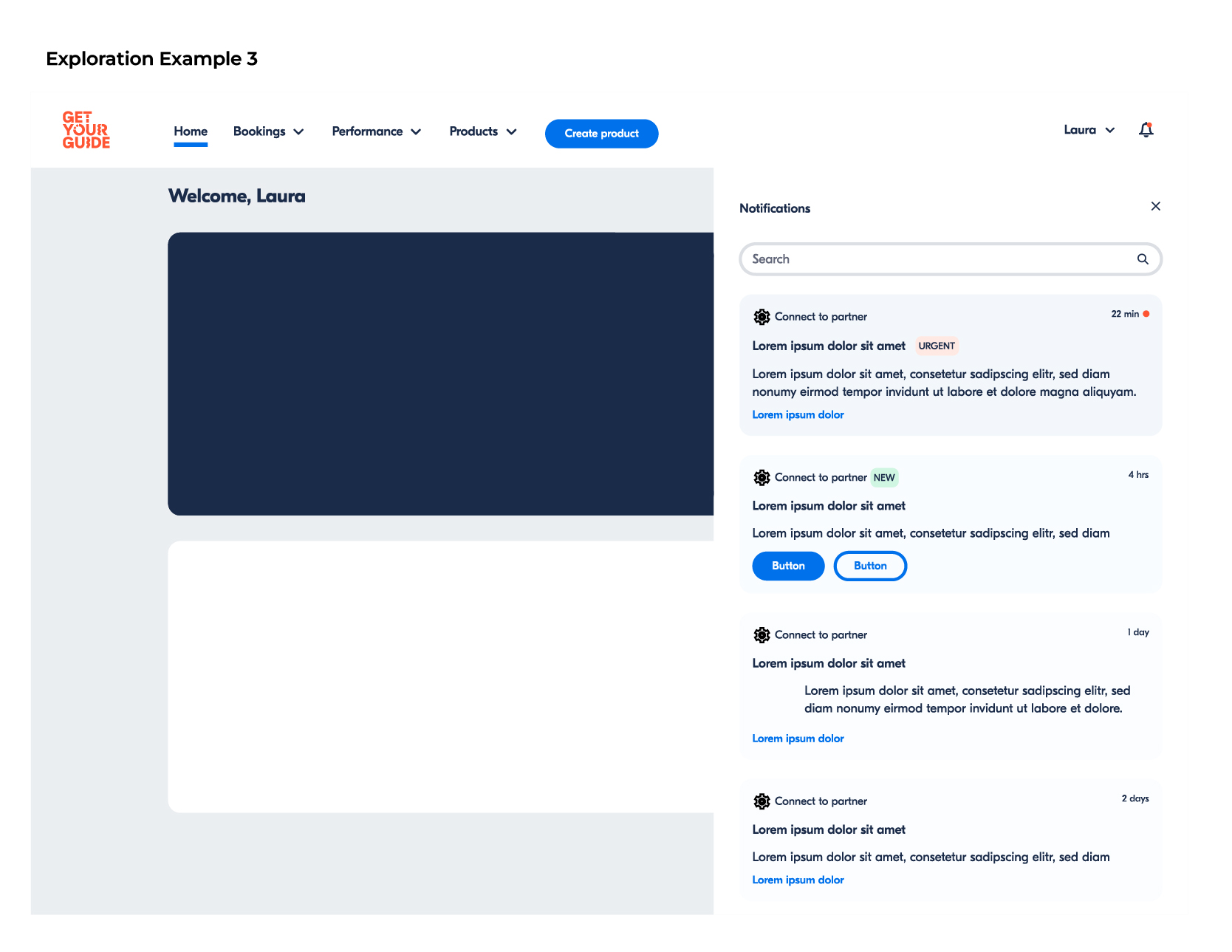
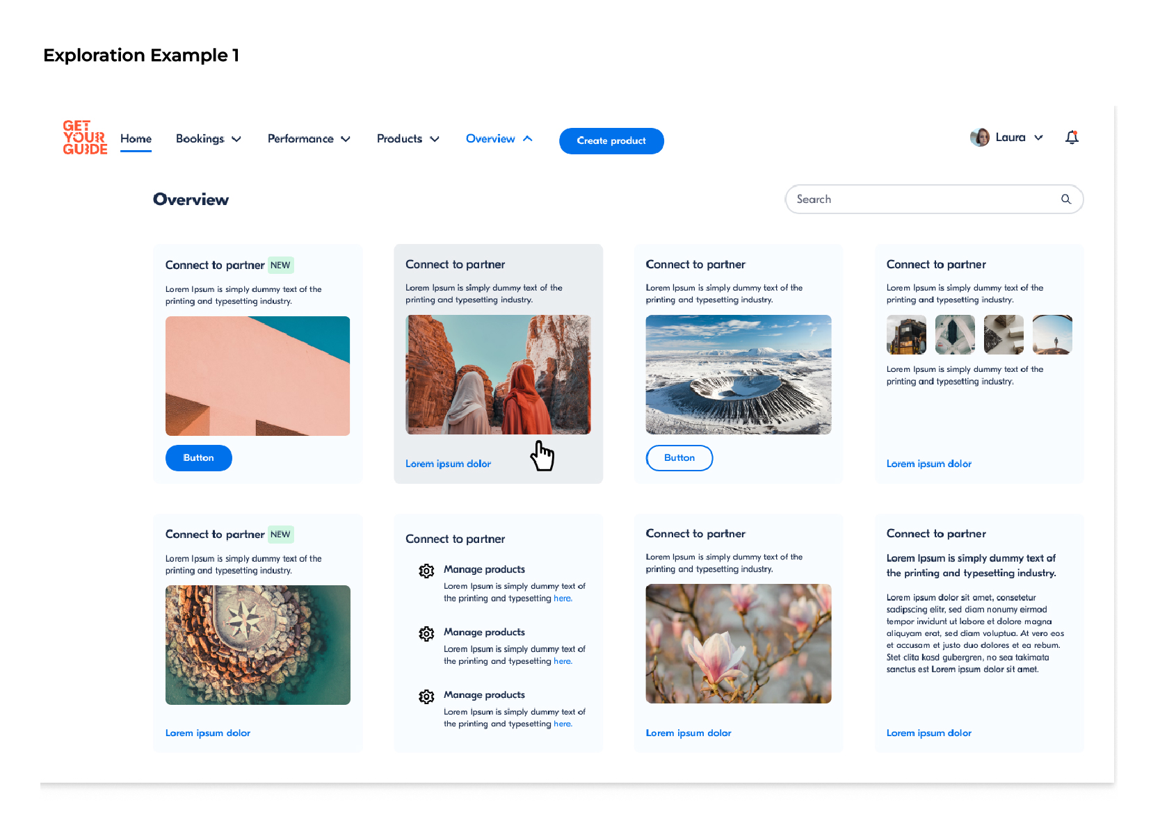
Exploration
Hypothesis
By simplifying the hierarchy, clarifying labels, and creating more logical groupings, we expected users to navigate faster, engage more with key features, and reach their goals with less friction – whether new to the portal or long-time users.
Final Design
We explored multiple navigation patterns and learned that simpler UI consistently produced better results. The final design introduced a clear, lightweight structure with concise labeling, logical feature grouping, and a flexible layout that scales across responsive web and native app platforms.