Client
CGM: CompuGroup Medical
Resposibilities
UX/UI Design
Funnel Optimization
Information Hierarchy
Testing
Category
B2C
Data & Analyticy
Health Care
Year
2017
Designing a More Accessible Digital Health Experience
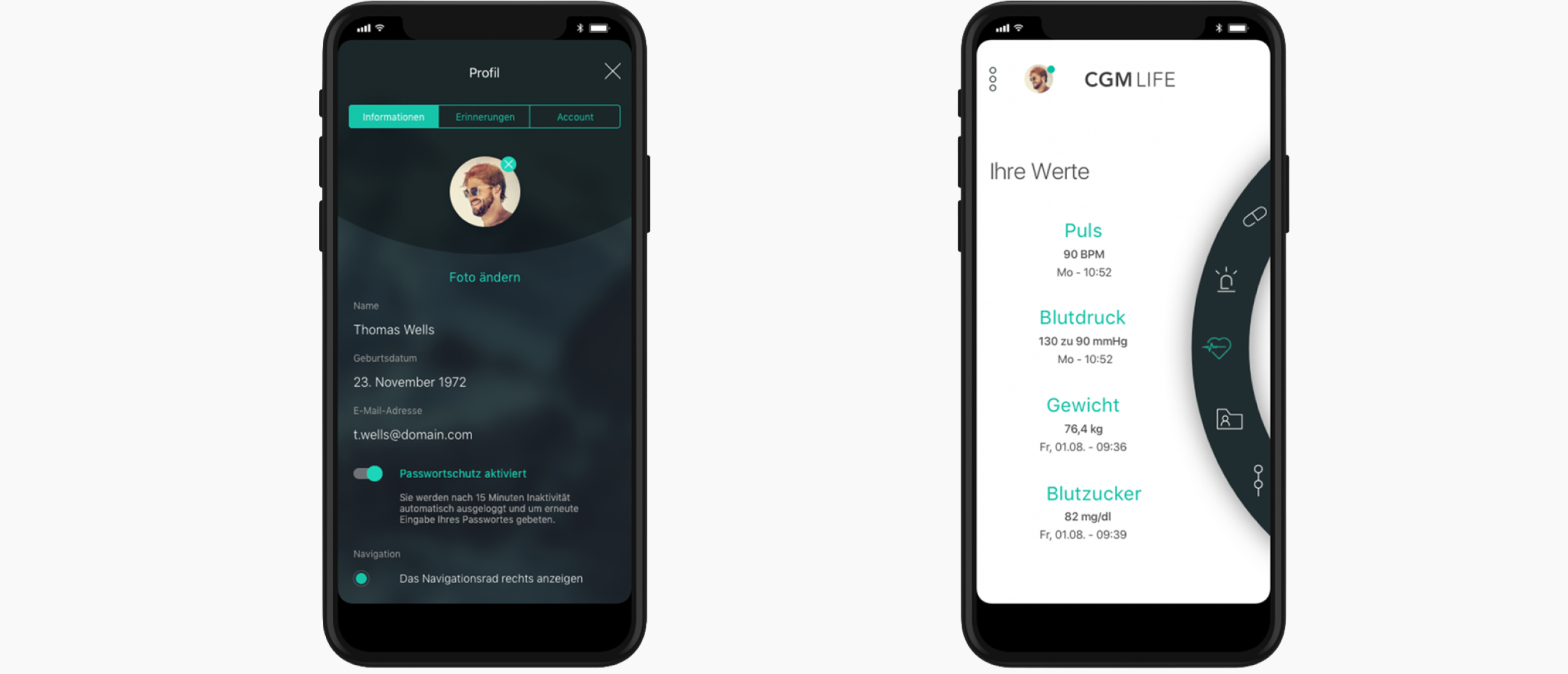
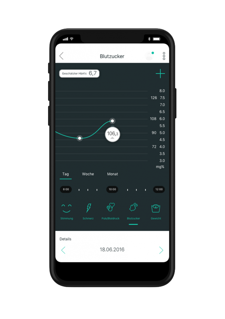
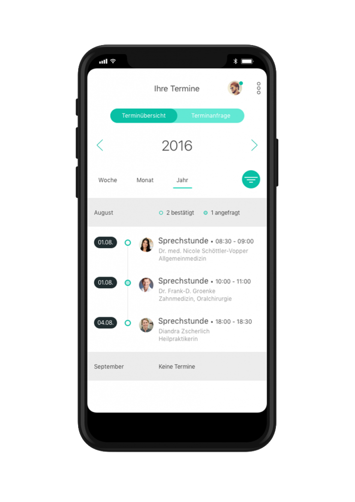
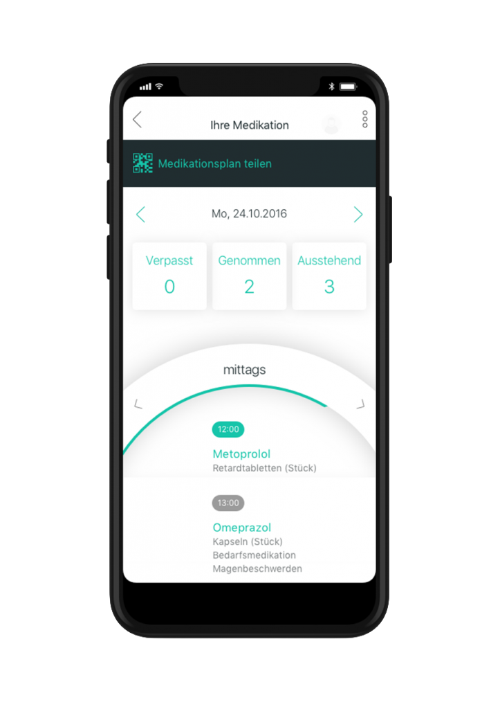
As a Freelance Product Designer at CompuGroup Medical, I worked on a mobile application that allows users to manage their personal medical information. Connected to the user’s health insurance, the app enables individuals to access their medical history, prescriptions, documents, and treatment records in one place. I joined the project at a late stage in development after the product lifecycle had initially been handled by an external agency, with the goal of improving usability and refining key parts of the experience.
The Problem
When the project was handed over, much of the application had already been developed, leaving limited room for structural changes or additional user research. The existing UX and UI design followed a modern, experimental style that prioritized visual novelty but did not fully align with the needs of the target audience. Many interaction patterns required a higher level of digital familiarity than expected from the app’s users, which risked making essential health information harder to access and manage. The challenge was to work within the existing design and technical constraints while adapting the experience to feel clearer, more intuitive, and more reliable for everyday use.
The Goal
The goal was to enhance usability and ensure that users could easily navigate their medical data, understand their records, and access important information when needed. The design needed to maintain the existing visual foundation while refining interaction patterns and simplifying the overall experience. By focusing on clarity and functionality, the app aimed to provide a dependable digital space where users could confidently manage their health information.
Hypothesis
If the interface and interaction patterns were simplified and aligned with more familiar usability principles, users would find it easier to navigate the application and interact with their medical information. A clearer structure and more predictable interactions would make the experience feel more approachable, increasing overall engagement and trust in the product.
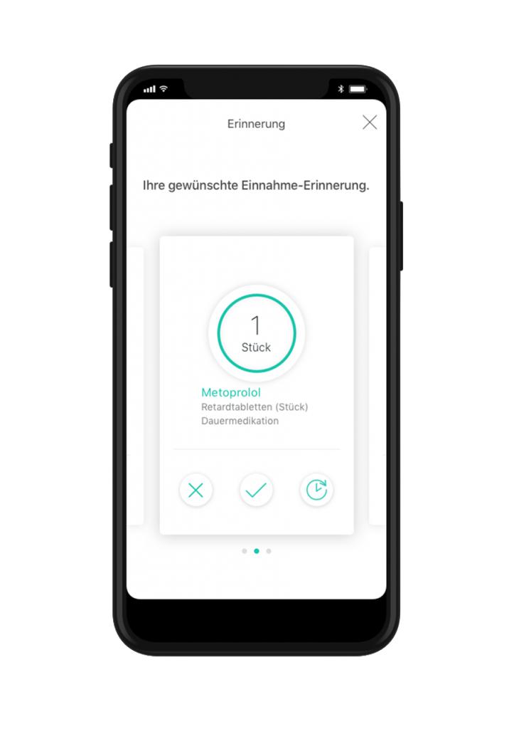
Final Design
The final design focused on improving clarity and usability while respecting the product’s existing visual language. Navigation structures were simplified, interaction patterns were refined, and information hierarchy was adjusted to make key medical data easier to locate and understand. By prioritizing functionality over visual experimentation, the experience became more predictable and accessible. The result was a more balanced product that maintained its modern appearance while better supporting users in managing their personal health information.